at least an attempt
I thought with all the economic collapse and AI mayhem going on it might be nice to just have a page of notes on Gurney's book, with other things thrown in since I’ve been collecting notes and tutorials for over a decade at this point.
All of the images I have here are thumbnails that can be clicked to see full size, paintings are public domain images from museum websites that I've linked to, and photos are mine with Creative Commons Attribution-ShareAlike 4.0 International.
I did want to have some more modern examples but it's kind of overwhelming on top of copyright etc.
ALSO I couldn't decide on thumbnail size, it's hard to balance, and yes I know about the picture element etc, but I don't have a PHP backend to autogenerate things.
Direct Sunlight
“A clear sunny day has three different systems of illumination: the sun itself, the blue sky, and the reflected light from illuminated objects.” The highlights from the sun are easy enough to notice, but keep an eye out for things like the blue sky and pale objects bouncing light into shadows and giving their color to them. Here's a good video
Overcast Light
“-is ideal for complicated outdoor scenes. One of its virtues is that it allows you to paint forms in their true colors without dramatic contrasts of light and shade.” Direct sunlight bleaches the highlights and muddies the shadows. A lightly cloudy day gives everything more vibrant colors and makes details easier to see, free of glare. Indoor lighting can be soft, but is always more directional than the everywhere at once of the open outdoors. If you’re a digital painter sitting in your dark dungeon dreaming of the outdoors you might not consider this. As for me, I’m in a room on a corner with two windows, which takes us to-
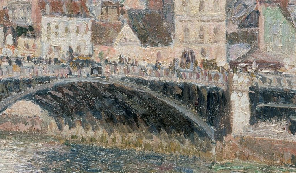
I like this Camille Pissarro, here's a close up crop-
Window Light
“Assuming the sun is not shining directly through the window, the daylight that enters a room from outside is usually bluish.” Looking around my room in December, I can see pale sunlight from the south window, and faintly blue from the east (in warmer months it’s more greenish from the trees and grass). The walls are a vivid blue as well, which is another factor to consider.
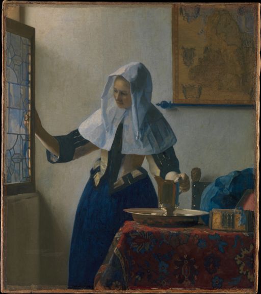
Vermeer- Young Woman with a Water Pitcher
Candlelight and firelight
“The light is fairly weak, dropping off rapidly as objects recede from the flame.” which is the good old inverse-square law in action. This is easier to observe with the eye, photos tend to overexpose the light and underexpose the dark. Also, adding a soft glow helps.
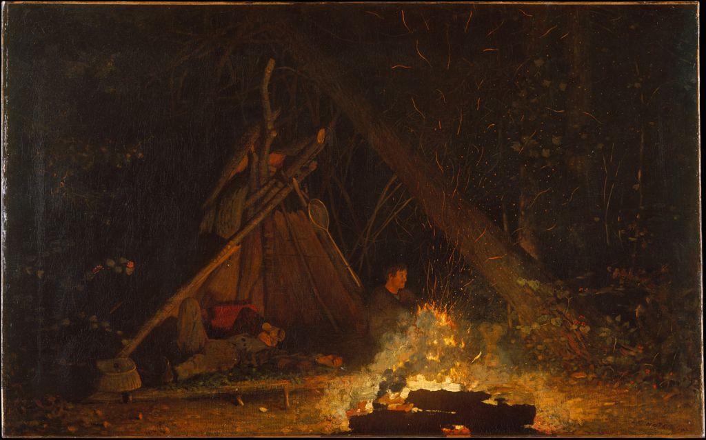
Winslow Homer, Camp Fire
Electric lighting
I think this chapter may be out of date, depending on your house! He says the main types are incandescent and fluorescent, but I’ve upgraded to LED for most things. But the most important thing is to keep in mind the spectrum or as he says- “The color cast is the dominant wavelength of a light source.” Incandescent bulbs tend to be heavy on warm and weak on blue, while fluorescent have mostly yellow-green. Sodium outdoor lights are mostly yellow.
For LED they can vary, so just keep in mind it may be more yellow or might be more white or even blue. I went through my house, the desk lamp has a very white LED bulb, in the living room there’s two lamps each with a different color! One is more yellow-orange, the other more white-green.
Keep in mind a lampshade will make a sharp circle of bright light on the ceiling, but below tends to be diffuse and broken up by objects.
Complementary shadow colors are noted later in the book, the cast shadow from each light takes on the color of the other light. So I suppose if you have say a figure at a window in a night scene where indoor is warm soft and outside is a harsh streetlight that might be useful.
One spring morning I conveniently had the sun shining straight in at the wall where the desk lamp was also on.
The LED light is on the left and the sun filtered through branches on the right.
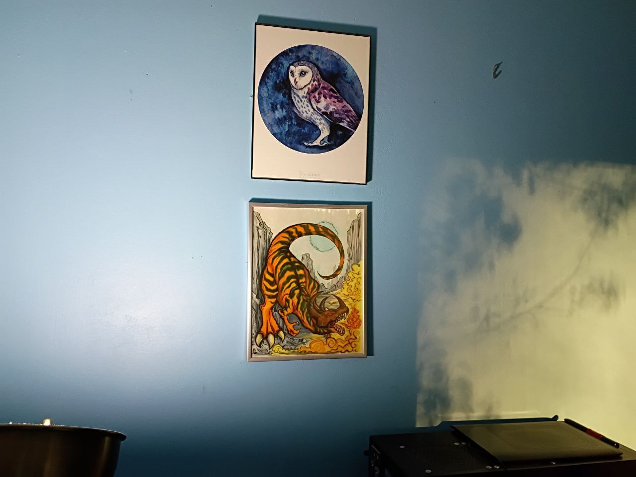
There's alsoa couple of random prints I got years ago.
Luminescence
Things that glow at cool temperatures like when you shine a blacklight on a diamond. That’s right, when you take your bucket of dirt home from the Crater of Diamonds State Park try shining a blacklight on it! Oh, you want art tips.
Luminescent colors often gradate from one hue into another. It's easiest to paint DARK first, then add glowing LAST.
Transmitted light
When light passes through a semitransparent material. Gurney lists four kinds of light on leaves-
- sunlight passing through the leaf, strongly yellow-green.
- the shadow under a leaf is dark green.
- the shadow facing up has blue-green from sky and vegetation.
- sunlight reflected off the top of the leaf is bright but has weak chroma because the waxy surface scatters it.
Also after living in the woods for so long I can tell you most leaves on trees and grass will have a shiny waxy upper side, and matte (sometimes fuzzy) lower side. This is remarkable when there are dead leaves or short grass where being stomped down isn’t as obvious, the leaves tend to get flattened in a way the light is different in the trail than the random scattering of leaves around it. It sort of makes a pale line, but unless fresh even I have trouble finding it.
Subsurface scattering
happens when light enters a translucent material- this includes skin! It’s most obvious with backlighting, in either thin objects like slice of orange, and on the body areas with thin skin like the hands, nose, and ears. I’ll have to find some examples of how darker skin effects this.
Caustics
This sounds like “the property of being able to corrode organic tissue” because both come from the Latin word “causticus”. Optic caustics are a result of waves of water both reflecting light above and refracting it below. Underwater caustics are probably most familiar from tropical scuba diving photos. The rising waves act like lenses to focus the light below, but no more than thirty feet, or ten meters. It needs a sunny day.
Caustic reflections are light reflecting from the water surface, with the troughs of the waves acting like convex mirrors.
If you’re not near a tropical beach or Venice, even an ordinary glass with water in it also produces caustic effects as light passes through it. If you fill it with clear acid, it will be both caustic and caustic!
Specular reflections
Shiny surface becomes a mirror. Bare metal and glass are the most obvious ones seen in everyday life. It’s also obvious on wet objects. “In general, the highlight on any glossy surface is not pure white, but a combination of the color of the source and the local color of the object.” So a clear glass bottle in the sun will be fairly white, but a cherry red convertible should lean red.
Annular highlights
appear in scratches on metal and twigs in trees. Gurney has a list-
- The more reflective the surface, the broader the range of values you need to paint it.
- Convex reflective surfaces, such as chrome, reflect a miniature view of the scene around the object, including elements beyond the limits of your composition.
- Whether you’re rendering digitally or traditionally, the specular pattern is a a separate layer added on top of the usual modeling factors that you use to render the object.
After twenty years of digital art I have to say you BETTER be using layers, even if it can be hard to not paint on the wrong one.
Separation of light and shadow
Checkerboard illusion is a basic example of how the brain interprets things to match expectations versus literal visual input.
Wikipedia has a good article.
Proko has a video (which references Gurney a few times) if that works better.
Or how about this Gurney video on how to make it yourself.
Occlusion shadows are where one object rests on another. This should be the simplest to handle with human or still life practice.
Common lighting angles
Three quarter lighting is popular for people, with light coming from about 45 degrees in front of the model.
Frontal lighting comes directly from the viewer’s perspective.
Rim lighting is when the light is mostly shining from behind a subject, but makes a fancy glow around it.
It’s not quite the same as contre jour, which is a bright diffuse light behind the subject.
Reflected light falls off quickly (that inverse square law again!) unless the source is very large, like a lawn. The effect is clearest with no other light sources, since they blend with each other and the color of the object itself. It’s common in scenes outdoors or with windows.
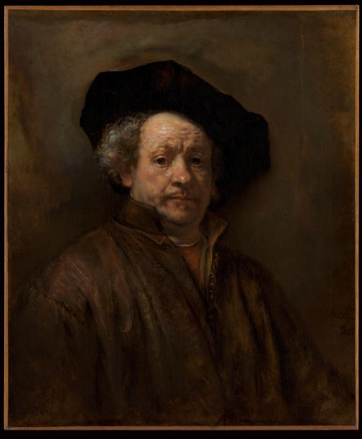
Self-Portrait by Rembrandt (Rembrandt van Rijn) 1660
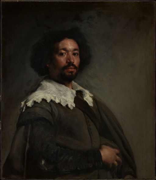
Juan de Pareja by Velázquez, circa 1650.
Edges and depth
He talks about how cameras work versus eyes. A camera will only focus on one plane at a time, so the background tends to be blurry, while eyes adjust to each area they focus on. So if you want a “photo realistic” painting you’ll have to mimic the camera, not the eye, though normally people think of the camera as being more realistic.
Color
Gurney has a section on the color wheel and suggests combining RGB plus CMY as the primaries for digital and print, but calls it Yurmby which is awkward so I just call it RGB+CMY. Below is a CSS generated color wheel, the CMY makes strong lines for some reason but makes it easy to see them in between the RGB.
But to go into web design details, that one uses HSL, and this one uses the fancy new OKLCH that has a wider color gamut.
This also brings up additive versus subtractive.
Additive is combining light, which if you mix all of them together you get white, which is light, so that should be easy to remember.
Subtractive is mixing pigments, which tends to become dark, because is absorbs the light- subtracting it, because it only reflects a small part of the spectrum.
Local color is what you’d see up close in a white room with soft light. How product images for online stores are sometimes, if they’re fancy.
Here's a Gurney post on color stuff
Structural versus pigment
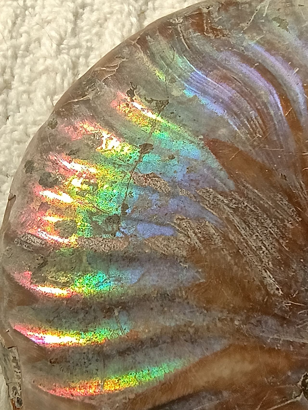
Gurney didn’t say anything about structural color but it’s important to know about. Simply put, pigments absorb certain wavelengths and reflect others, the angle of the light mostly doesn’t matter. Structural colors come from the light bouncing around on microscopic bits and pieces- that’s why black chickens can have a green sheen, the pigment is black (close enough for an example) but it has tiny structures that reflect certain wavelengths.
Video full of science plus more science
Here's a close up of a fossil ammonite I have!
Limited palettes
Gurney suggests a painter should have a limited palette. One reason of course is he’s using actual paint to carry around, where I uh sit a computer and have a slab of plastic and a program with one million colors to pick from.
However even digital artists should try it. A set of colors you already know are harmonious should all blend well into a whole. And learning to blend instead of just color pick is better because photo refs may be a mess of a few pixels of stray colors, I’ve had this problem before myself.
Monochrome is the simplest limited palette, and also a good practice to work on values. Something I need to work on myself.
Here's a Gurney post with images and here's an even more hardcore
only TWO colors, plus white includes a video demo.
I know it sounds crazy but limited palettes have great uses like vintage style
Accents can liven things up, like with the gray and earth tone discussion earlier, having a mostly dull scene with highlights of higher chroma can draw focus and create drama.
Triads
“Any three basic colors, but not necessarily full chroma colors.”
This leads us to gamut mapping, which I’m familiar with as a triangle on top of a color wheel, and you only use the colors inside it. The three points are the subjective primaries. One point is near the edge in a strong bright hue, and the other two are more muted.
“The color that appears in the geometric center of the gamut is the subjective neutral for that color scheme.” and it can be any color, since the center can be outside the center of the wheel itself.
In fact he says “A useful gamut mask is an equilateral triangle that is shifted over to one side of the wheel without overlapping the center at all. It’s called an atmospheric triad.” This is best used for color scripting, which I’ll note below.
Of course you’re not limited to triangles, you can bump up to having four points, or have a triangle on one side with an accent color opposite.
On color scripting he says “in a sequential art form, such as a graphic novel, illustrated book, or animated film, no color scheme stands alone. Each page, panel, or frame must be seen in relation to the one that proceeds and follows it.”
I’ve seen things like this online, where they compress the colors of Disney movies into a long rectangle of color samples.
Color constancy
Humans have a habit of interpreting local colors as stable and unchanging, despite any changes in light color, shadows, or form. This has popped up constantly, in the checkerboard illusion, in the use of neutral tones, in gamut mapping. It’s just as important as the usual fundamentals of direction, form, and basic color terms. It’s one of the things that Impressionism used often.
Grays and neutrals and mud
Gurney says “We sometimes associate grays with blandness or dullness, but they are actually an artist’s best friend.” and “Grays can provide a setting for bright color accents. They give space and scope to a composition, and they can create a quiet, reflective mood.” This ties into a later section “the mud debate” which is mainly a physical paint problem, though can apply to digital as well, of how much mixing of color is good, in fear that it will end up looking dirty or muddy. Partly this is the mixing of the paints themselves, leaving streaks of color instead of a monotone blend, but also ties into the whole concept of local color and the checkerboard illusion as well. “To preserve pleasing variations in grays, it’s a good idea to mix them from complementary pairs” is the same advice I’ve seen for painting digitally. And it’s usually easier spice up something too dull than tone down rainbow vomit.
A really cool video!
Light and color throughout the day!
I thought this would be a useful way to organize things, Gurney did suggest at the end doing a serial painting in one place outdoors at different times and seasons. I know when you start making art you expect the same praise you got in kindergarten after scribbling with crayons but you won’t be slapping out perfect paintings without making lots of bad ones. I say this as someone who has trouble drawing the same thing twice because I get bored with it.
I live in a forest so dawn is very dark trees with bright pale sky to the east with yellow and orange peeking between as the sun first rises. On a February morning I tend to get up before dawn when there’s just enough light to see shapes. Even with the window open it’s hard to see more than hints of color. A dark red shirt still seems dark red, but a blue blanket could be blue or gray. A light yellow blanket and dark green sheets have some hints but very faintly. After sunrise the colors start to appear, and seem to be “normal”, though I can tell they are darker than they are in full daylight.
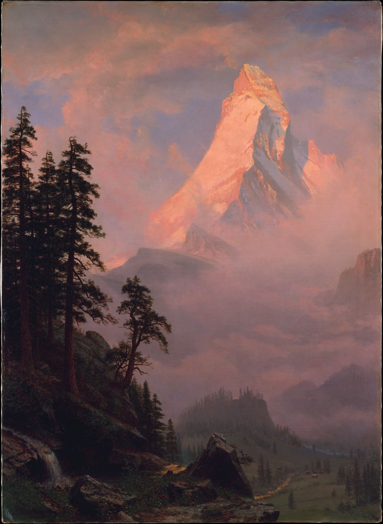
Sunrise on the Matterhorn
Sky blue
Quoth Gurney “The sky is not a flat, even blue. There are two systems of color gradations in a daytime sky. One system, ‘solar glare’, is governed by the proximity of the sun. The other, ‘horizon glow’, depends on the angle above the horizon.” This is something I noticed noticed years ago on cool clear days- the sky is lighter near the sun, which makes sense due to how bright it is. There’s just so much white light coming in that it overwhelms any Rayleigh effect. The horizon is lighter as well, due to the light going through more atmosphere and dust. Heck, I had a Bob Ross episode on one night and he mentioned making things lighter in the distance, though not why. Leonardo da Vinci knew this too. It’s called atmospheric perspective. “The illuminated sides of objects generally lose their color saturation, becoming grayer as they go back in space.” While white objects become warmer.
I thought this was neat so just gonna quote the whole thing- “The point of the deepest, darkest blue, called ‘the well of the sky’, is at the zenith only at sunset and sunrise. To the precise, the well of the sky is actually 95 degrees away from the setting sun at the top of the sky. At other times in the day, it is about 65 degrees away from the sun.”
Clouds
When facing the sun, clouds appear mostly dark with strong rim lightning. The bigger the cloud, the darker it gets. Conversely, with the sun behind the viewer, large clouds are bright on top, dark underneath, while small clouds appear darker, a light gray.
Cloud shadows can be useful to add variety to open landscapes. Of course they have to match the clouds in the sky! The edges should be soft, and the shadow is a mix of blue sky shadow and white light from the cloud.
“The colors of the rainbow should always be lighter than the background, because the color of the rainbow is added to the light of the scene behind it.”
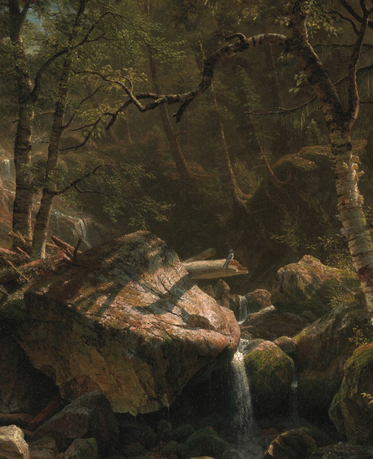
Foliage
Foliage is tricky since it’s so complicated and leaf color depends on tree and season. The spring leaves are softer and more yellow on most deciduous trees. The rays of light passing through it create a dappled light. Keep in mind these are rays coming directly from the sun so should converge there. Don’t make them random just because you remember that the ground under a tree has spots of light. Gurney video on dappled light!
Here's the center of Mountain Brook by Bierstadt
The green problem:
Green is a very common but very intense color, so it’s hard to handle. His tips are-
- instead of using premade green paint, mix yellow and blue for weak and varied hues.
- vary the green hues across the canvas.
- mix up pink or reddish gray to weave in and out of the greens.
- Or, prime the canvas with pinks.
In the spring it's ultra vibrant.
Eclipse
Fun fact, if the spaces between leaves are small enough they become pinhole cameras and will show a thousand eclipses on the ground if conditions are just right.
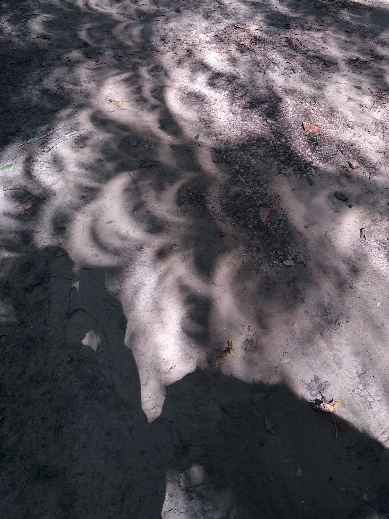
Here are my notes from the 2024 eclipse where I was on the edge of totality.
April 8- dawn noisy with birds, typical spring morning. irises and spiderworts are blooming.
by 1PM still very cloudy! can't tell any difference tho starting to eclipse now. doesn't help it's sprinkling.
1:20 clouds breaking some, can tell the sky is a different blue, grey and pale, but not far from hazy conditions yet. randomly cloudy then more sun. it's not as intense as usual. some birds are still singing.
1:30 clouds breaking, noticeably dimmer, sky still blue but duller.
1:45 sky dull dark blue-grey, like evening but cool instead of golden or orange. Even with 98% of the sun covered it’s still at least as bright as full moon. Birds and frogs making noise until the darkest part.
Snow
Soft snow diffuses the light, and has blue-green shadows due to that Raleigh effect. I only see snow every 5 years or so, so have a Gurney video
Water features
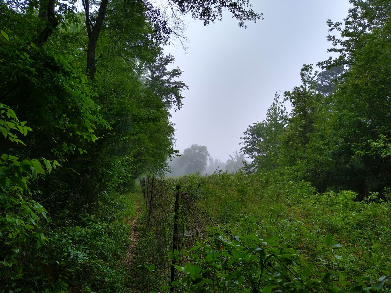
The surface reflects light so depending on the angle you have a mirror image or blinding light, and underneath it refracts the light so objects underwater are shifted! The reflection means that the amount of light reaching underwater objects is reduced so they’re darker. How clean the water is matters as well. In the little creek by my house, it alternates between deeper pools and shallow fast stretches where the water generally looks clean, but you can see if there hasn’t been rain lately the deeper parts turn into a muddy tea with silt and decaying leaves. Not to mention there’s some sort of orange algae. Reflections then to have blended edges unless there’s sharp contrast.
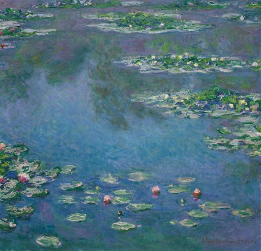
Here's a maybe too small 1906 Monet with water lilies.
Low sun
Reverse atmospheric perspective happens when the sun is low and shining through dust or fog. It’s called reverse because the standard rule for a sunny day is cooler in distance, but the particles scatter warm diffuse light.
Golden Hour is similar, only the sun is so low that the normal amounts of dust and air molecules scatter the light so the sky above is a stronger blue and the sunlight is golden.
And then of course the sun reaches the horizon and the colors shift into the brilliant oranges and reds. This varies widely. Some days when it’s clear I just see yellow. Sometimes the right clouds will make the neon retro 80s bright pink or dark red on the west. Sometimes when there’s a thick low cloud cover the pink will spread all across the visible sky.
Is moonlight blue?
I always thought the moon was yellow and the night just dark so everything was grayish, but Gurney says many painters have made moonlight blue or green. Conveniently it’s a full moon as I’m writing this and I was driving home down empty countryside roads. The moon itself seemed weak yellow, silver gray, close to the color of old coins. The sky around it did seem to lean blue, close to charcoal or slate gray. As for the lighting of the ground, it might lean blue, but is so low in chroma it’s hard to specify. Of course I was going 60 miles an hour and had no convenient open field to pause in to make better notes.
Purkinje shift is the effect that red will seem darker relative to other colors as the light dims.
Gurney on moonlight